Color psychology applied to live chat
Customizing a live chat is one of the first things you should think about when setting up a chat widget over your website. Colors are one of the most powerful way to increase engagement with your website visitors. Discover how you can do it too.

Customizing a live chat is one of the first things you should think about when setting up a chat widget over your website.
Colors are one of the most powerful ways to increase engagement with your website visitors.
"Colors speak all languages."
Joseph Addison
There are many content over the web, stating about the impact of colors on engagement, especially in the marketing field.
Choosing the right combination of colors can improve your users' interactions over your chat button and therefore the number of conversations you create, which means more lead.
On the opposite, too many colors make a message confusing. How do you choose 2 or 3 colors? What to do with your own website?
Color psychology is one of the most interesting and most controversial side of modern marketing.
Here are some advices we can give you to make the perfect combination of colors between your website and your chatbox while being fully aware of what it takes.
What is color psychology?
Color psychology is the art of understanding how colors affect feelings and perceptions. In marketing and brand identity, the psychological impact of colors.
There are numerous scientific studies that have tried to classify colors and emotions or colors and genders.
It has been shown that colors can decrease the perception of waiting time, calm down customers, or improve overall mood.
Using complementary colors combinations make things stand out
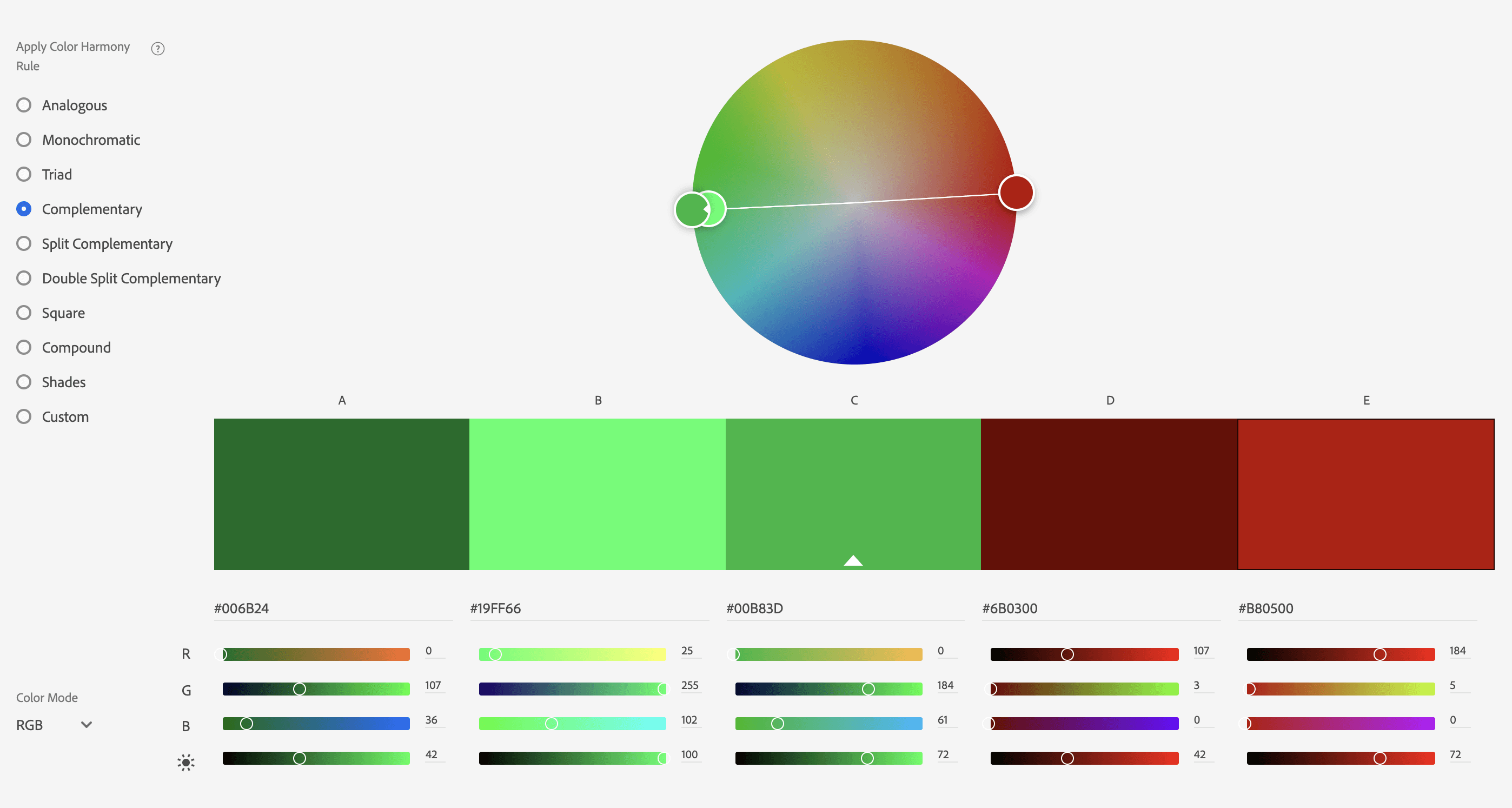
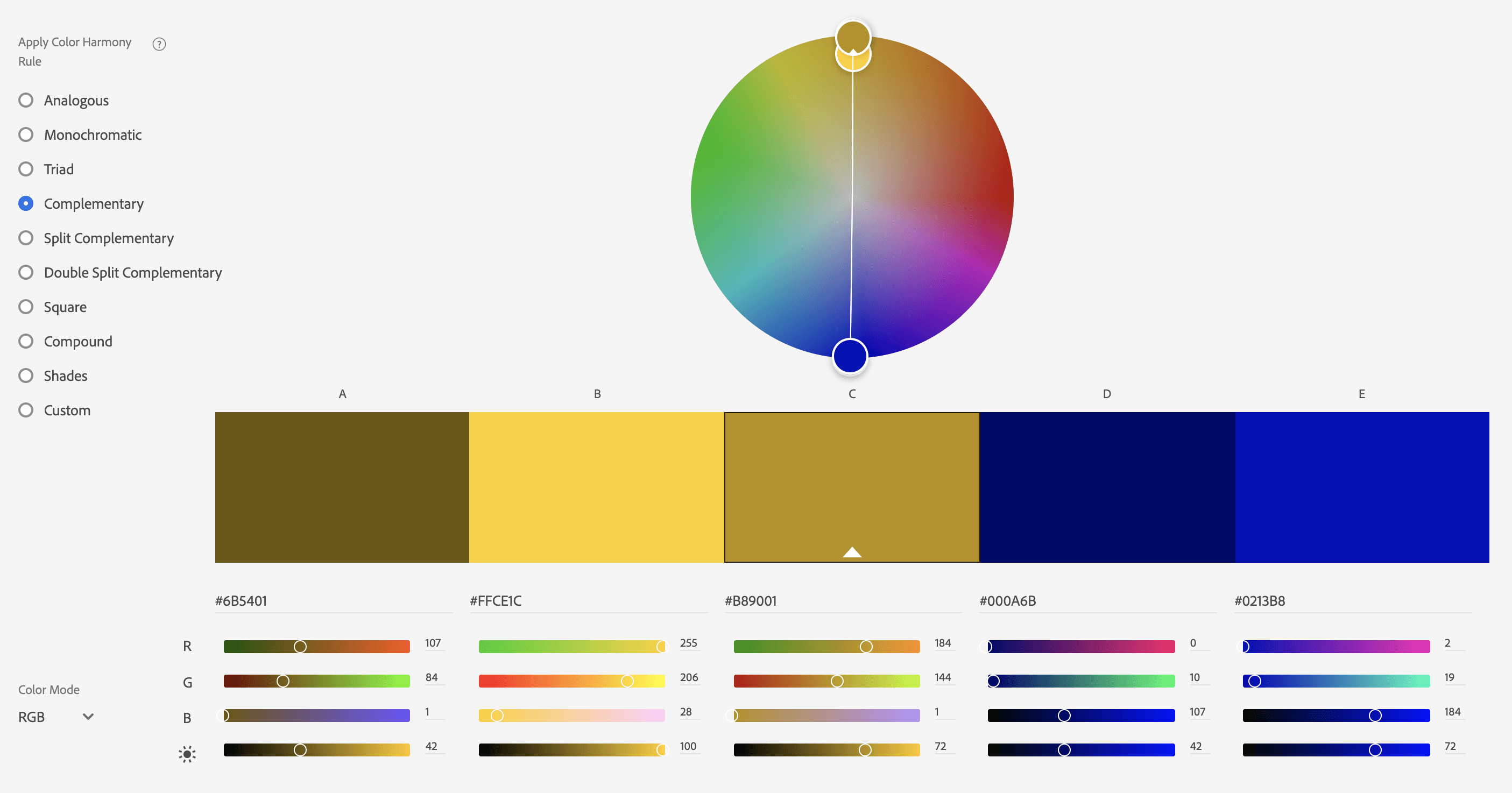
Complementary colors are opposite colors, as stated on the "color wheel" offered by Adobe, you can find them pretty easily.
Opposites attract! When the human eye has been looking at the same color, he wants contrast. Using a chat widget as itself will not be enough to engage conversations.
Use colors to make the most out of it and increase conversations.
Pro tip: If you want people to see your chat widget, think about a color that will be the opposite of your main color over your website.
Why should I take the opposite of my main color to customize my live chat?
It's simple, people are already feeling your brand identity all over the website. They can't see where they have to click if nothing is engaging with them.
Yes, you have chat triggers and chatbox tooltip that still can help your users to engage with your chat but the more your chatbox stands out, the better.
Not willing to have too many conversations? No problem, build a chatbot that will handle low-quality conversations to let your teams focus on what really matters.
Still wondering about the colors? Here are some things you should know when deciding the colors of your website chat app.
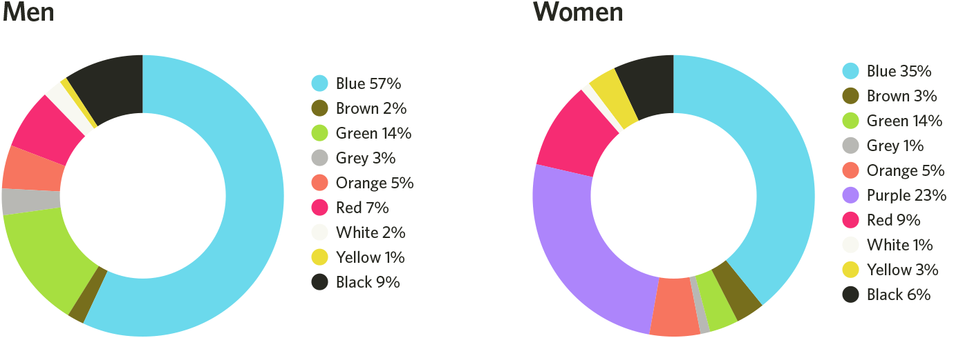
Also, be aware that depending on your target (eg. male or female) you should adapt the tones of your brand identity.
Alongside all those statements, you should be ready to ask yourself: "why?" or "Wouldn't it depends?"
And I'd say: "yes, you're right"
The good news is that research has recently improved a lot in terms of color psychology. Here is what we can find.
Colors impact memorization
As stated in this study, Green and yellow, which are chromatic colors, are more likely to enhance memorization of the displayed information than blanc and white.
It has also been disclaimed that low brightness fosters better memorization and stronger buying intention.
The final statement of this study should make us think again about our brand identity: it seems more interesting to compare hue and brightness than to compare warm and cold colors when trying to understand what consumers recall and what leads to a purchase.
Combining sounds to the brand atmosphere would enable us to better understand the impact of global behavior on e-commerce websites.
Colors impact trust and quality
In a study analyzing the impact of warmth perception thanks to colors over a website, results have shown that a better-perceived warmth of website design will impact the ability of a user to come back to the solution.
Another great study states that ambient store colors affect purchase-related variables such as people willing to buy are more attracted to warm colors than cooler colors.
For example, another study explained that a blue environment led to more simulated purchases, fewer purchase postponements, and a stronger inclination to shop and browse than a red environment.
Best combination of colors for your live chat
As we want to remain interesting for our readers, we've decided to share with you the best combinations of colors that you could set.
Obviously, there are not only solutions but the ones we like the most and think are the most engaging.
But first, let's discuss what parts of the website chat widget you can customize.
What part of the chatbox can I customize?
Inside a chat widget, there are many things you can customize: label, text, chatbox positions, and so on...
We will mainly focus on chatboxes and text colors to fit with the needs of this article but always remember that you might be able to go even further.
The chatbox tooltip
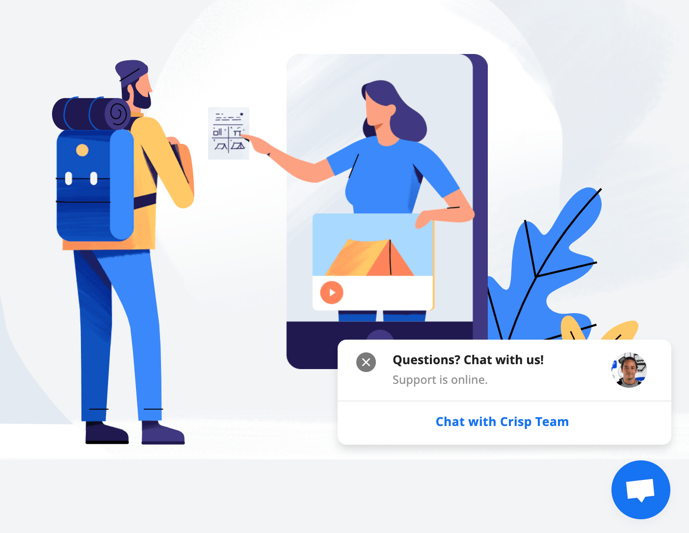
As you can see, over this tooltip, that works as a welcome message, you can act a lot on the copy. At this stage, the colors is also as important as the text.
The chatbox
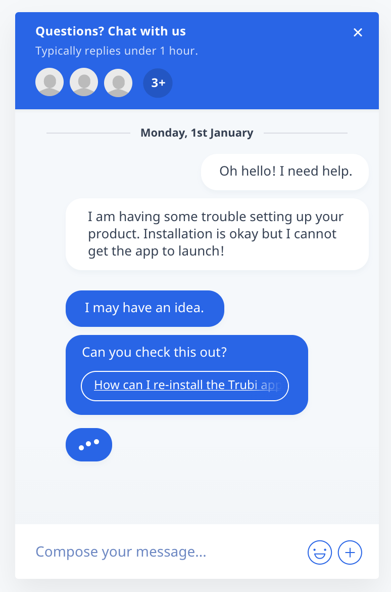
Here you can act on colors on two different parts of the chatbox:
- The main color that will modify the "blue" as you see it all over the chatbox
- The light color will impact texts and links colors
Now that you see what colors and labels you can customize over your chat software, here are some advises about color combinations.
Live chat customization colors
For dark-colored website
We advise you to go for a white chatbox that might contrast a lot with your brand identity and combine it with a dark grey.
Main colors:
- #ffffff
- #47555c
Another great choice would be to add light colors to dark websites, just as comet.co has done.
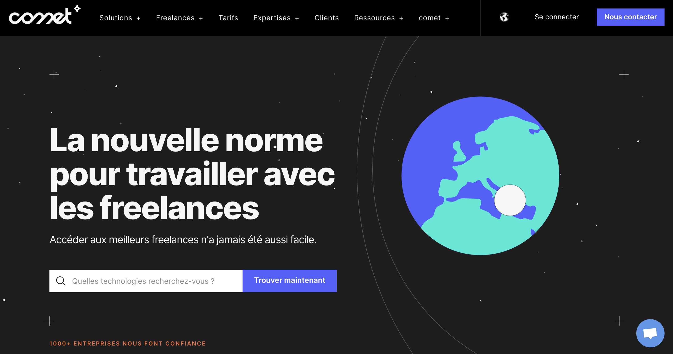
They combine a light blue to a strong white to mark the difference with their brand identity that tends to the dark.
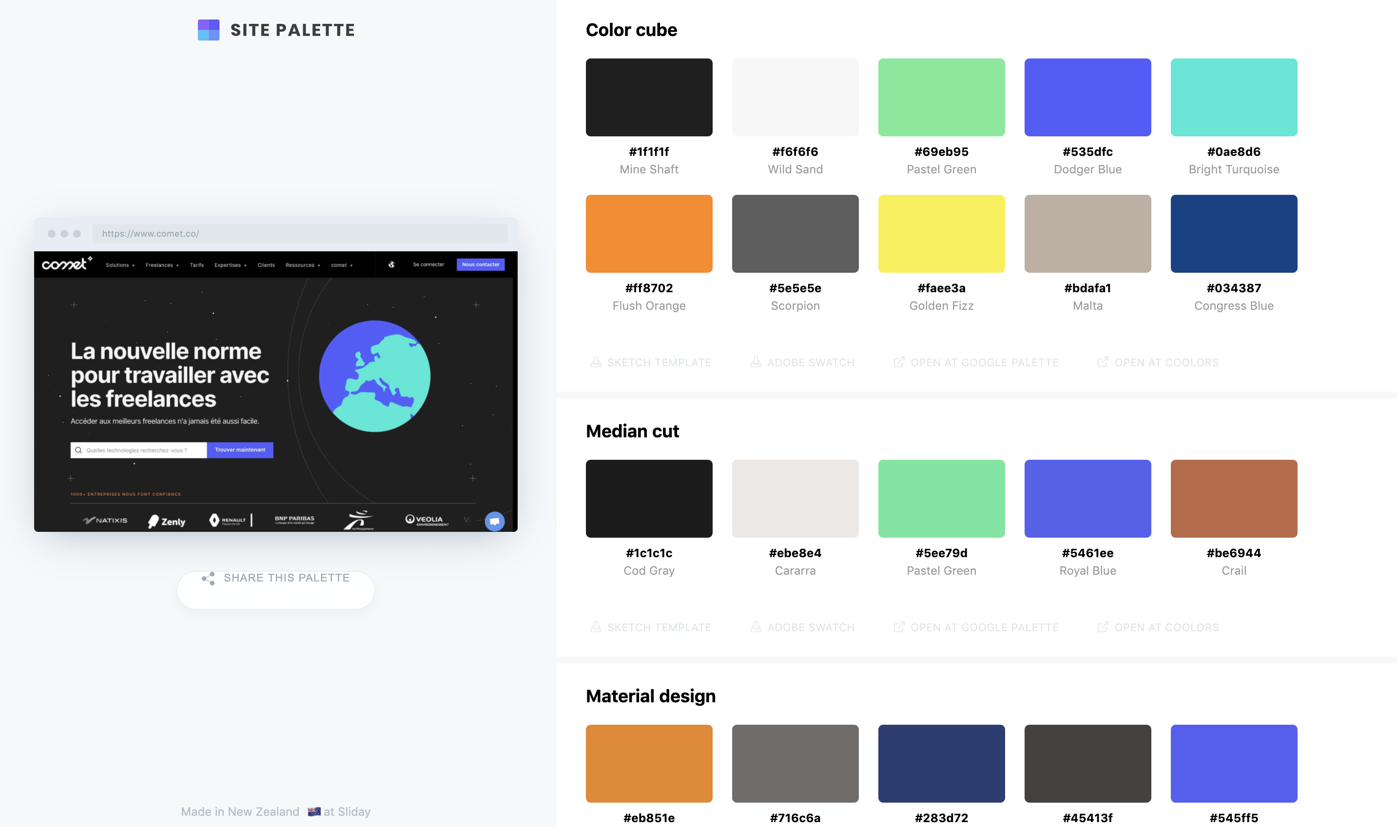
Here is there color palette for the chatbox:
- #5896EB
- #FFFFFF
Here is the color palette for the entire website:
For warm-colored websites
We advise you to go for a more contrasted palette that will refer to your brand identity.
Here are some examples of websites that are using webchat through with different color tones
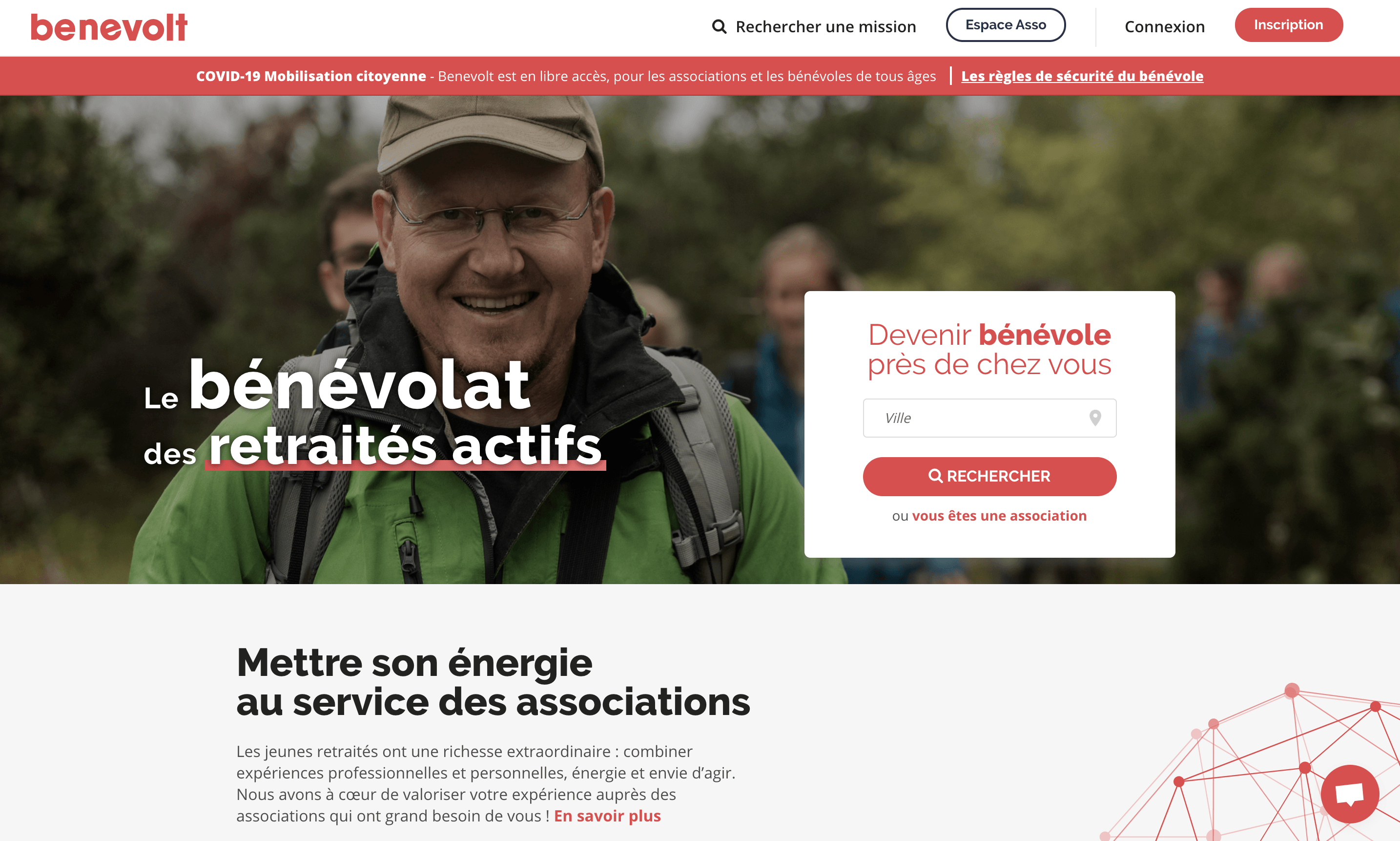
The chatbox is taking the same color as the key actions the users shall take. In our opinion, this might be a mistake.
It could lead to fewer key interactions such as becoming a member or looking for a city.
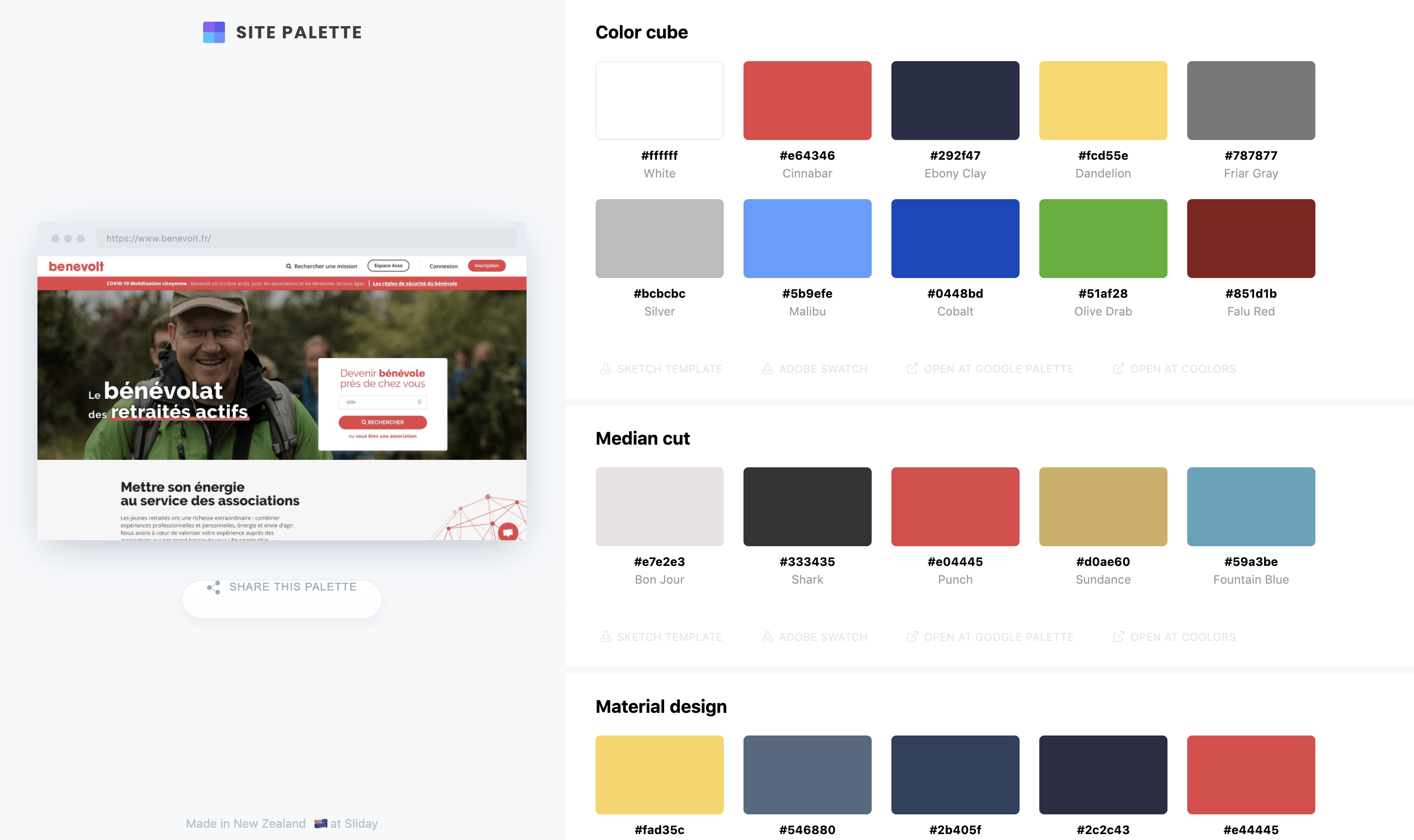
éAnd here is the color palette for the website:
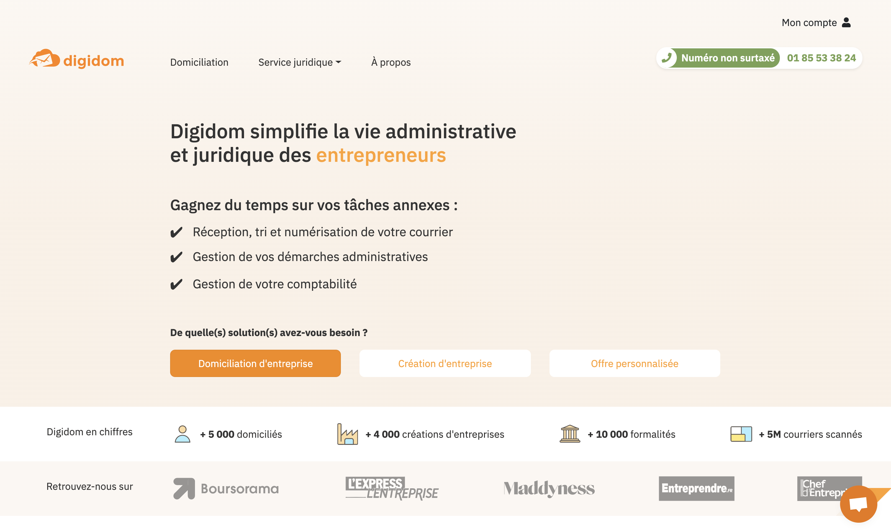
Here, the chatbox is not that visible, however, the team managed to combine the color to another important call to action.
Despite the color, that is appealing, the chatbox could be a bit higher so it floats above the greyed white and make the orange stand out.
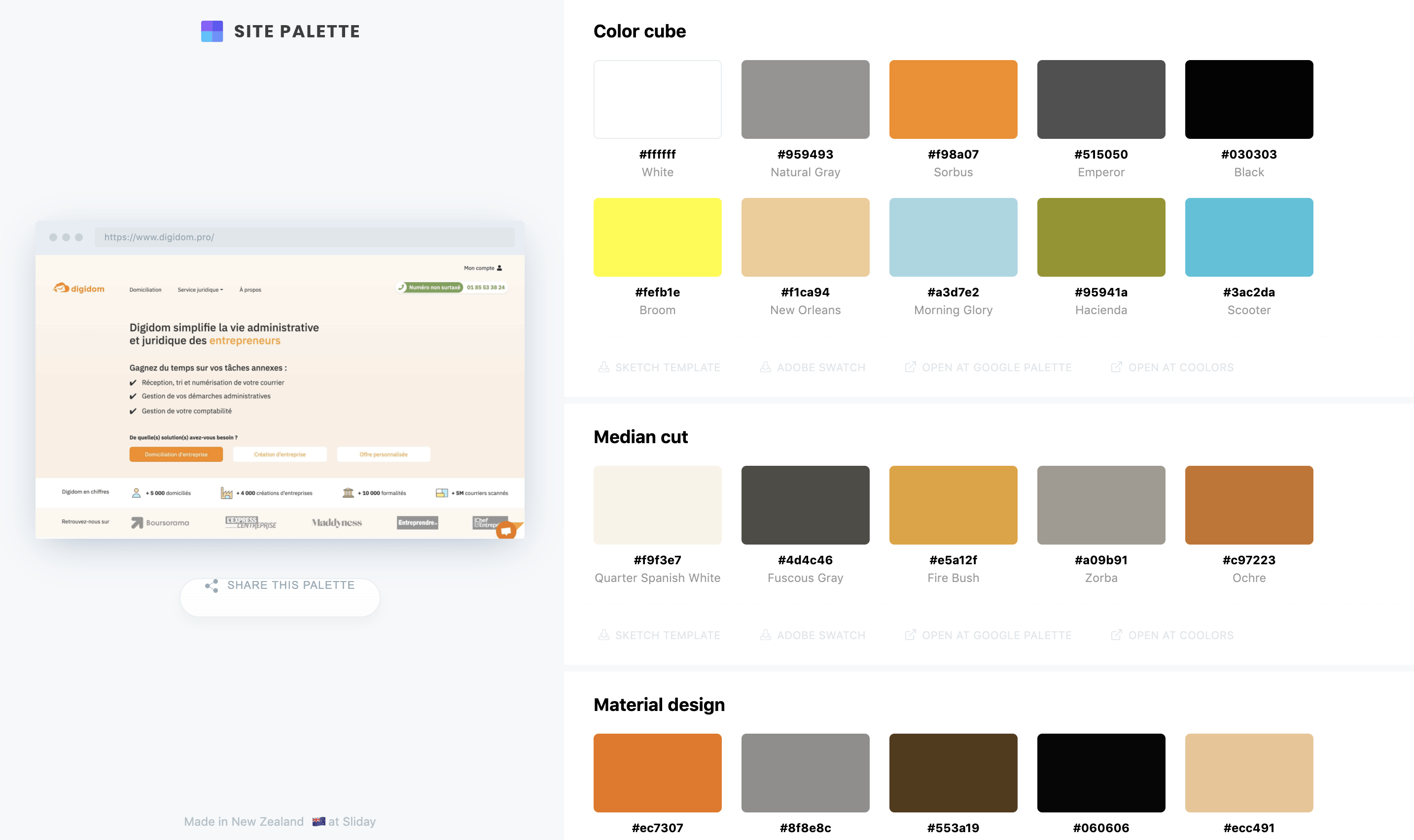
Here is the palette color for the website:
Finding your own color palette
As you know, there's still no cheat sheet to choose the perfect palette of colors that will impact the psychology of your users.
You can also use color grading software, check this article for a list of solutions: https://fixthephoto.com/best-color-grading-software.html
If at the end of this article, you're now with more questions than at the beginning, it means we've done well.
As this topic is a lot about assumptions and guesses, feel free to do your own, try colors, texts and positions to discover what works the best for your business.
Ready to get started with chat customization? Get in touch with us.

May 2025 - Product Update
Want to know what the team has done this month? Make sure to read this article.

April 2025 - Product Update
Want to know what the team has been cooking lately? Make sure to read this article!

March 2025 - Crisp Product Update
Want to know what's been cooking at Crisp over the past month? Make sure to read this product update.


